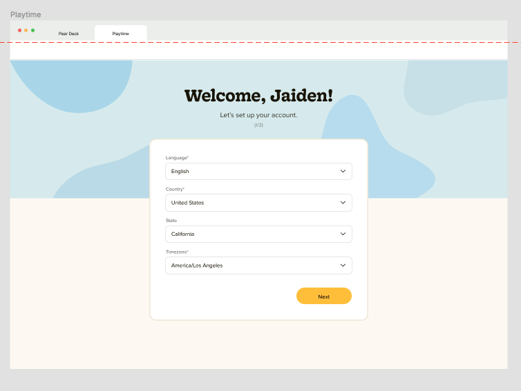
Pear Deck Launchpad Re-design


The very first header, subheader, and CTA need work. The header is a little bit ambiguous. “Access care with you in mind.” This could be read in multiple ways. Is access a verb that’s being used to give a command? Or is it an adjective that modifies the noun “care?” And what exactly does having “you in mind” mean? What are the real, tangible benefits? I would change to something like “Prioritize your health from anywhere.”
The subheader has the same issue with the word “access.” It also suffers from being too vague initially. Who and what, exactly, is at home or in-person? The doctor? I would change to “Whether you’re being cared for in person, at-home, or through telehealth appointments, choose a health care plan that fits your lifestyle and budget.
The CTA “Lear about your care options” is okay, but it could be both tighter and stronger. Also, I’m a believer that most buttons should be from the user’s perspective. If I’m putting myself in the user’s shoes, it makes more sense to learn about MY options instead of YOUR options. Also, learning about options isn’t as exciting about exploring or discovering. I would change to “Explore my care options.”
BONUS CHANGE - The photo…I don’t understand what it’s conveying.
Updating Blue Shield’s home page
Blue Shield’s Error Message
Error messages need to do three things. First, they should first explain simply and clearly that there is a problem, and state what the problem is. Secondly, they should provide a solution. Thirdly, they should make this whole process as pleasant as possible.
For this error message, I’d change the header to a warmer “Unfortunately, we weren’t able to change your password.” The subheader changes to “It looks like you’re missing a required field. Please try again or contact our support staff.” This tells the user that there’s a problem, and defines it, and then points to a solution. “Try again” and “Contact our support staff” are hyperlinked — which takes users to a solution quickly and easily. There are no dead ends or murky “contact your administrator” prompts. Plus, there’s a human touch and some warmness.
Header:
Unfortunately, we weren’t able to change your password.
Subheader:
It looks like you’re missing a required field. Please try again or contact our support staff.
Blue Shield’s Scary, Wordy, Redundant messaging.
The following message is scary, redundant, and mostly unnecessary. I would first of all, consult with the legal team to see if all of this is truly necessary. At the very least, I would re-word to the following. Most importantly, I would include an option for people to not accept:
Copy:
This system is for authorized use only. By using this app, you’re consenting to possible monitoring and recording. Furthermore, unauthorized use is prohibited and subject to penalties. To read the disclaimer in its entirety, click here.
CTA:
Accept and continue
CTA:
Deny and quit
Blue Shield’s Password Requirements
When it comes to password requirements, It’s important to say only what is required as precisely as possible, simply and effectively. This is honestly an absurd list and not necessarily for password protection. Nonetheless, I would to the following:
Header:
Enter a new password*
8-25 characters
Must contain at least one number, one upper case character, one lower case character, and one special character
Can’t use same character more than 3 times in a row
Password can’t have been used in the past 280 days


