Updating Pear Deck UX
As a UX writer for Pear Deck, I work with UX reachers and designers to improve task flows, compare and contrast UX with competitors, and listen to user feedback.
Based on competitor pain points and Pear Deck’s UX strength and weaknesses, we found some opportunities for Pear Deck in the following:
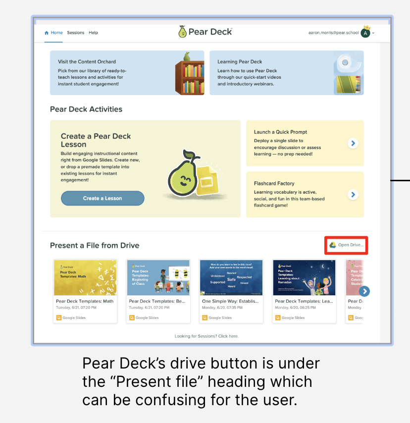
Provide users better direction on how to create a lesson from Google Drive
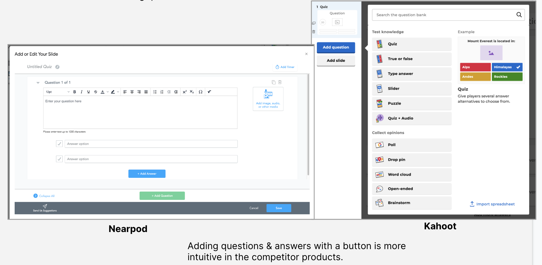
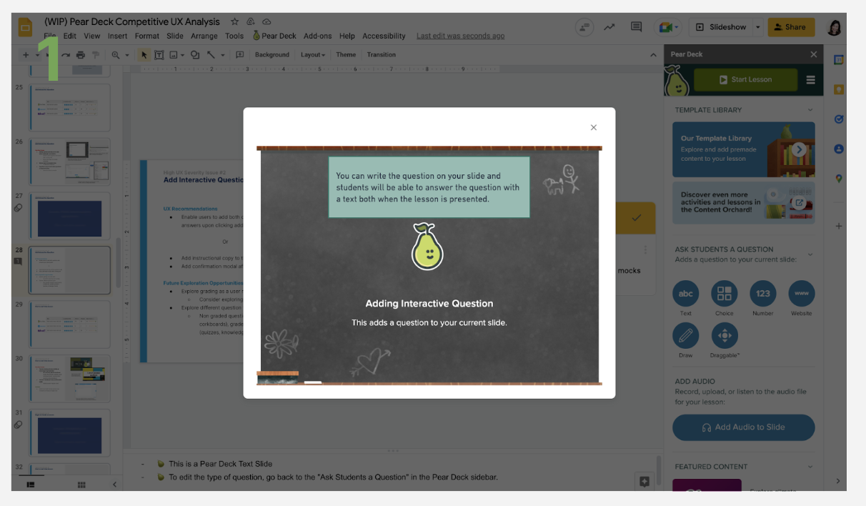
Create a more intuitive process for adding interactive questions
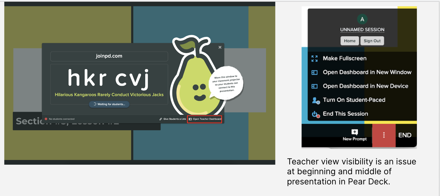
Give immediate, upfront visibility for the teacher dashboard
Rename the teacher dashboard altogether
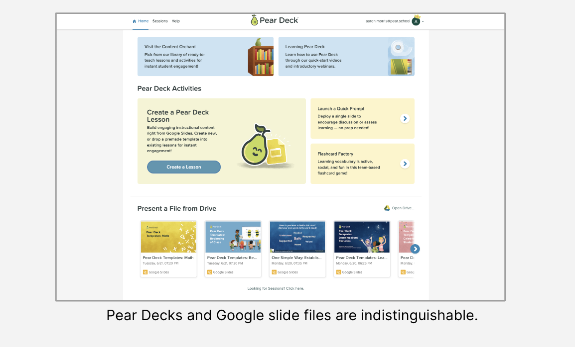
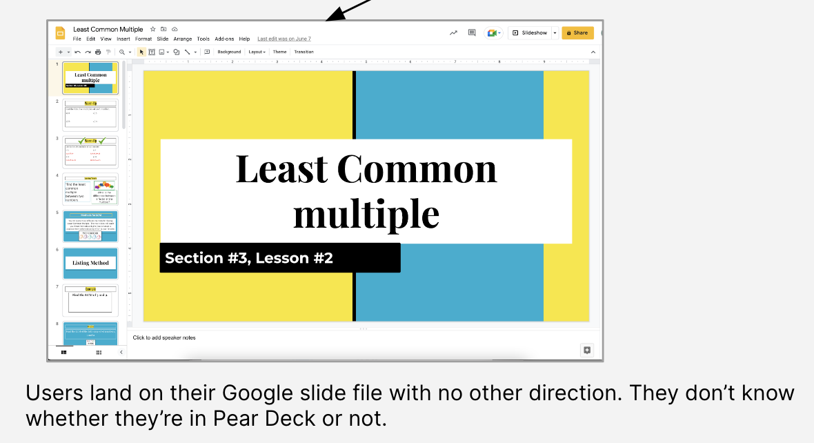
Separating Pear Deck and Google Slide files
Let’s take a look at those changes below!
⬇
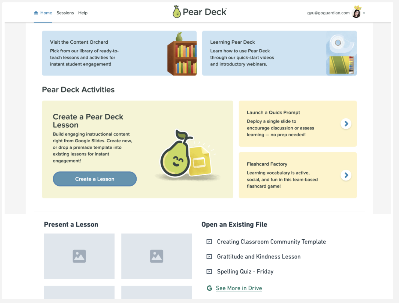
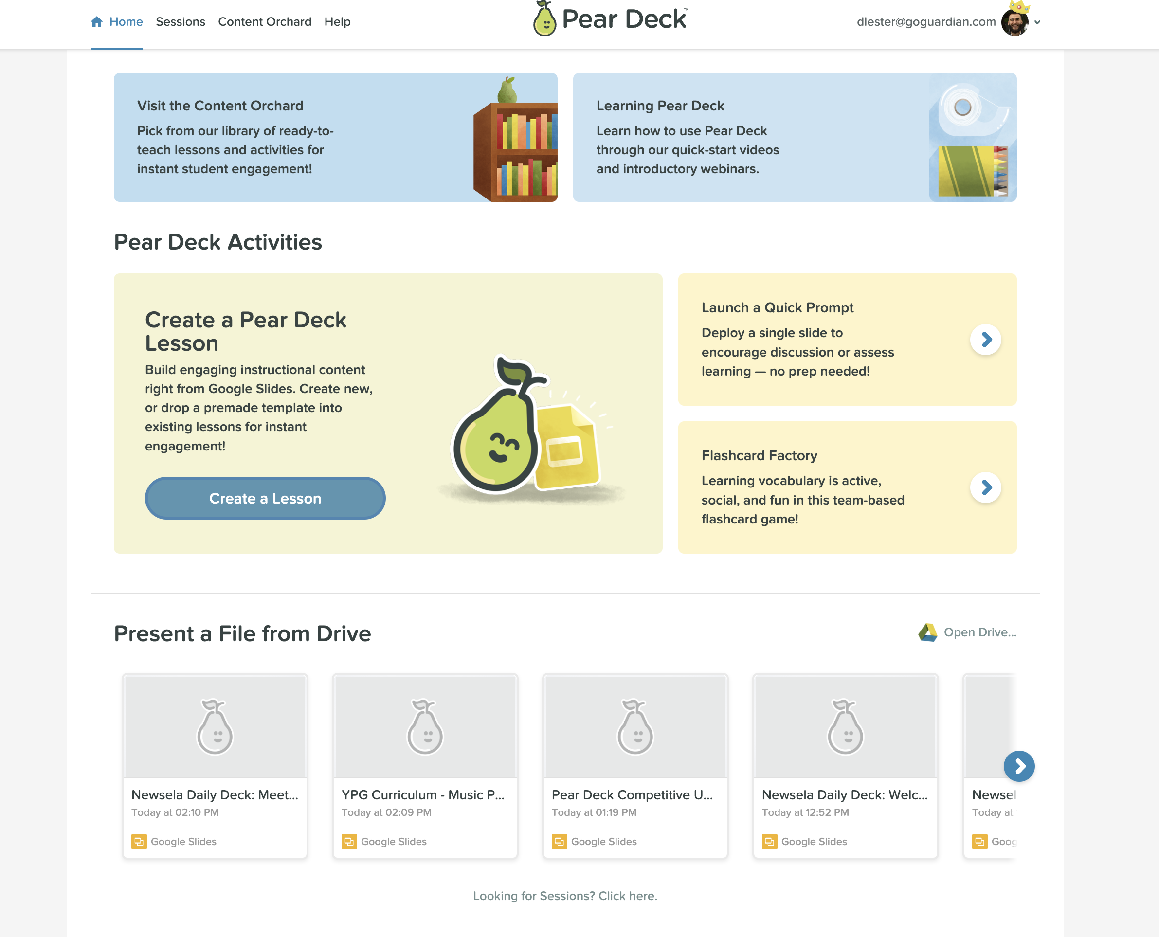
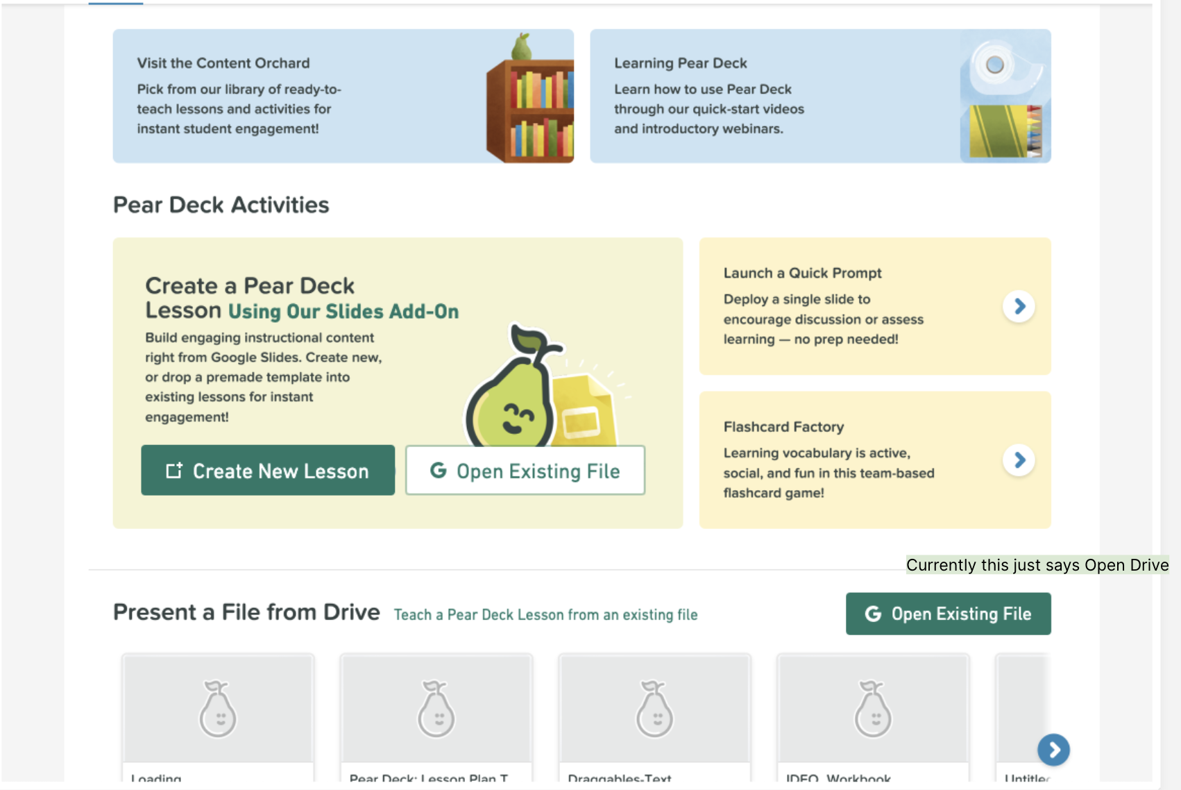
More seamless lesson creation
How to update the Home page
It was simply too difficult to create a Pear Deck lesson — both from scratch and from an existing slide. To help users make this process more seamless, we added “Create New Lesson” and “Open Existing File” buttons. We also elaborated on what “Present a File from Drive” means and made a larger, more intuitive CTA (“Open Existing File”).
Users were searching for a more obvious CTA — this gives it to them.
Users thought “Create a Lesson” was the only option — this makes it clear that you can open an existing file, too.
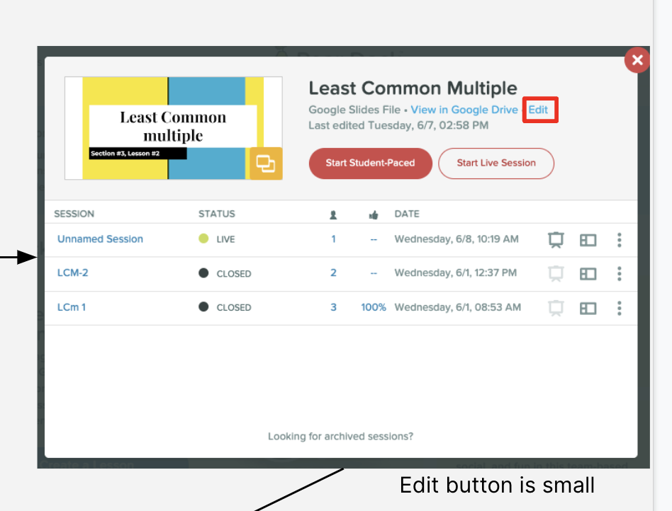
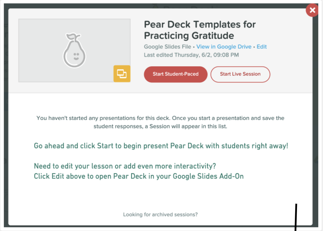
Updating empty states
By adding more information, users are able to learn how to present right away, edit slides, add interactivity, and more. This is a much better use of empty states.
“Start Student-Paced” is confusing. More explanation was needed.
The “Edit” button was hidden and unclear. This helps.
A reminder about interactivity gives users something next steps as their lesson is launched.

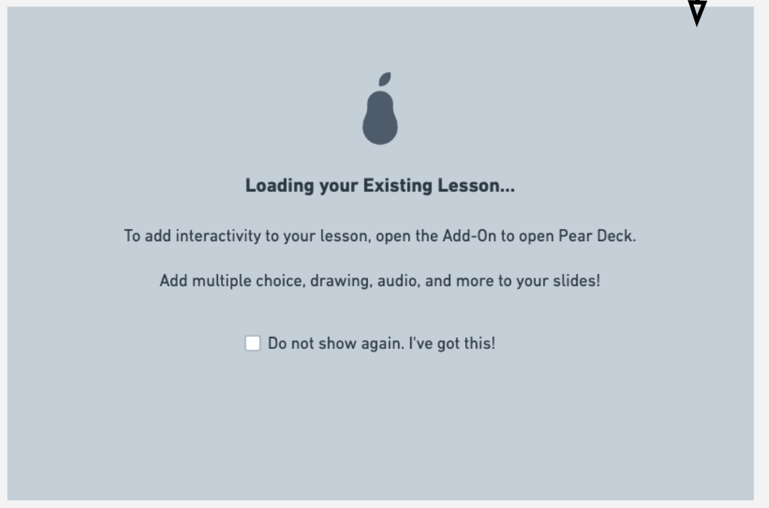
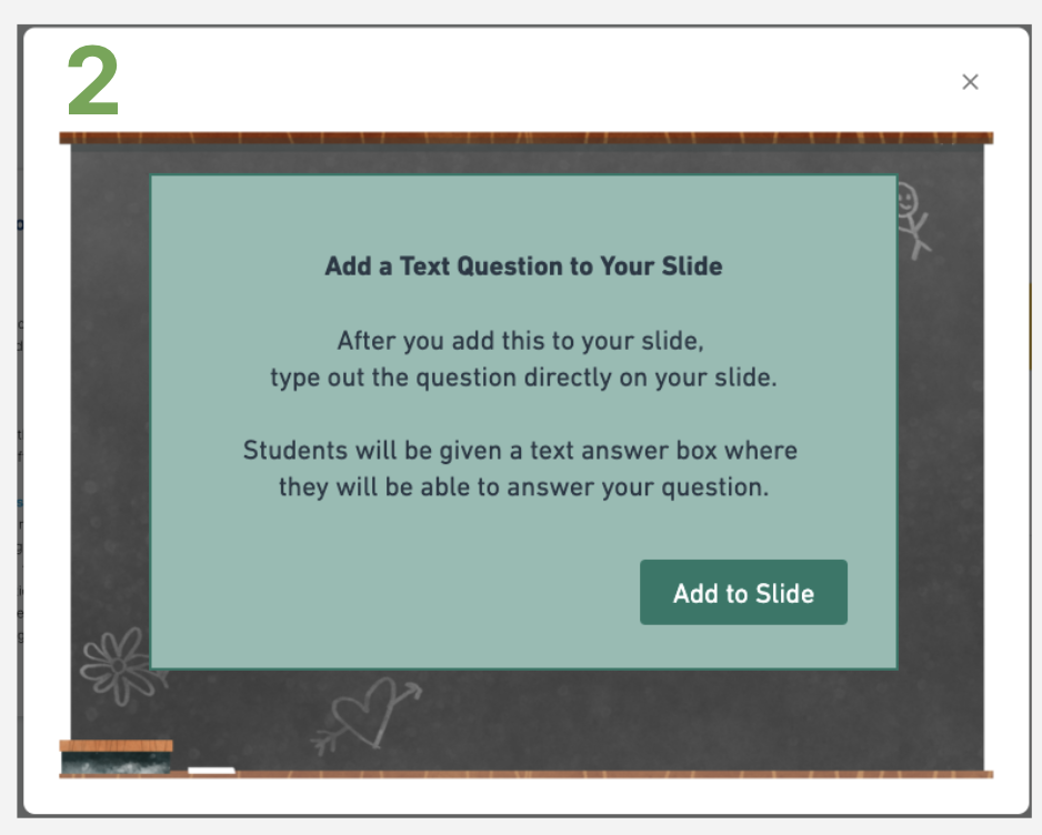
Adding instructional copy for clarity
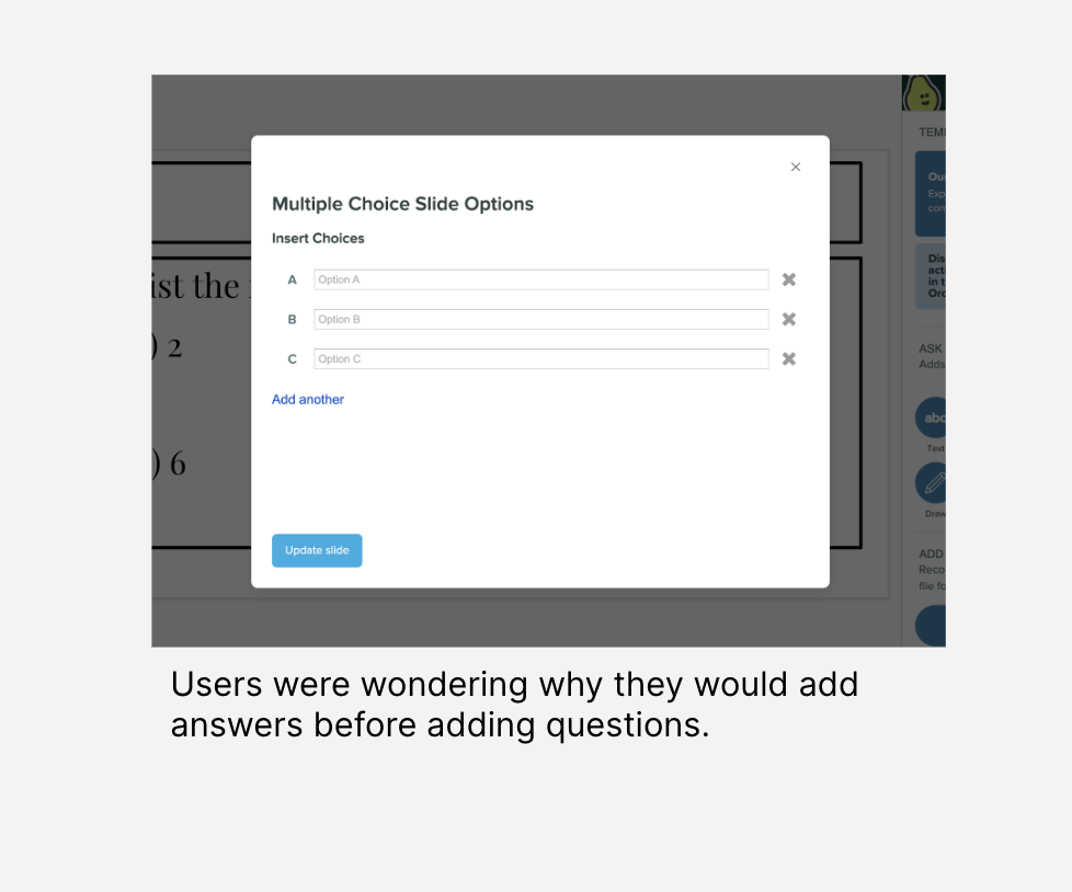
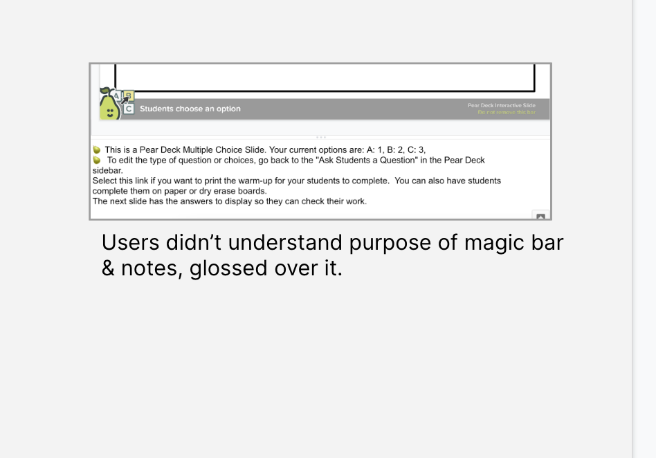
Improvement options
Option 1: Add instructional copy to loading screen
Option 2: Add a confirmation modal to allow users to read through instructions before adding the question
Option 3: Add the actual question to the model and slide for users

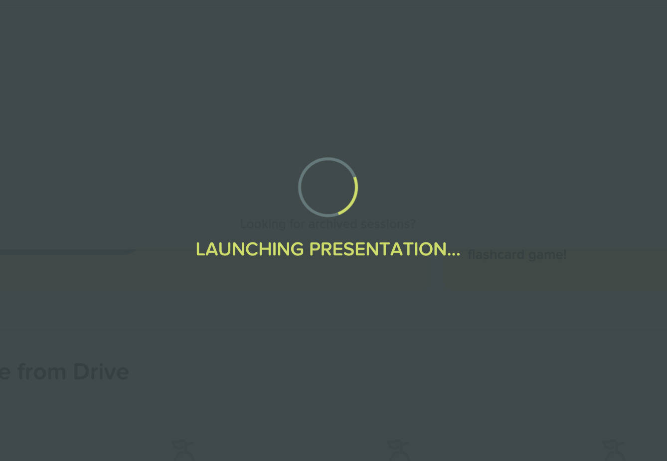
Starting a lesson
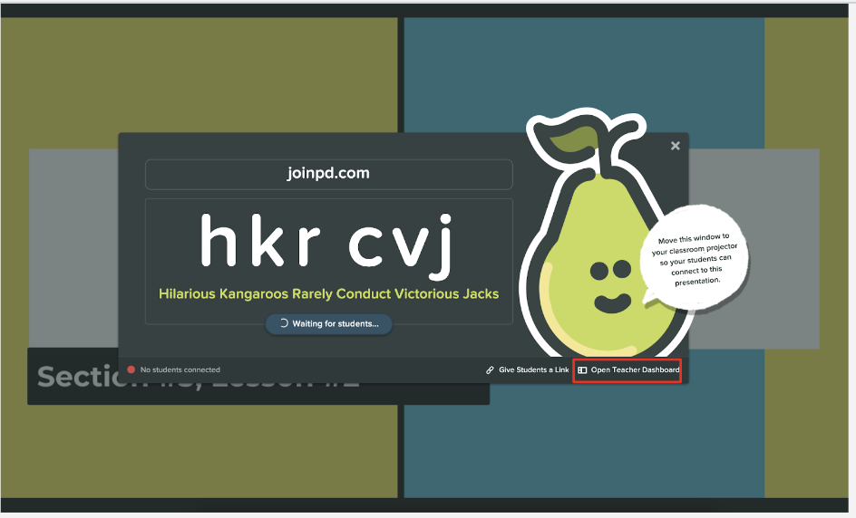
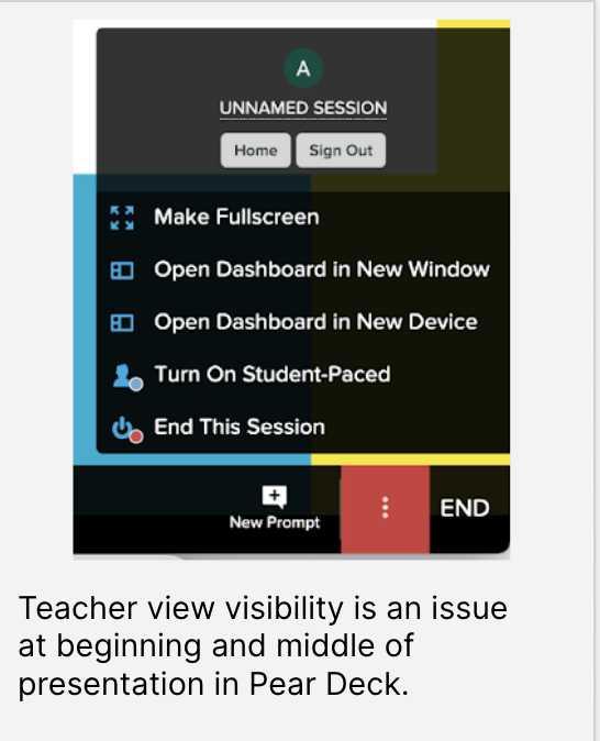
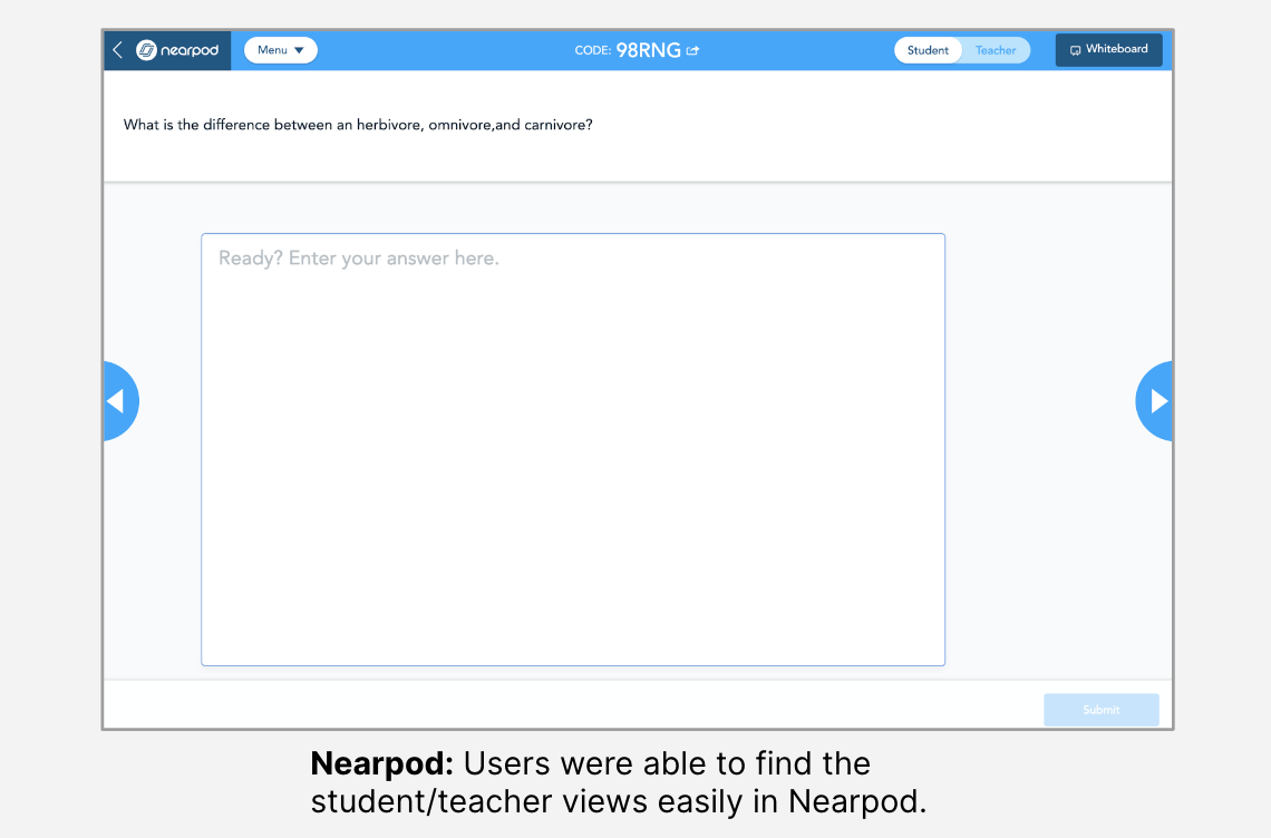
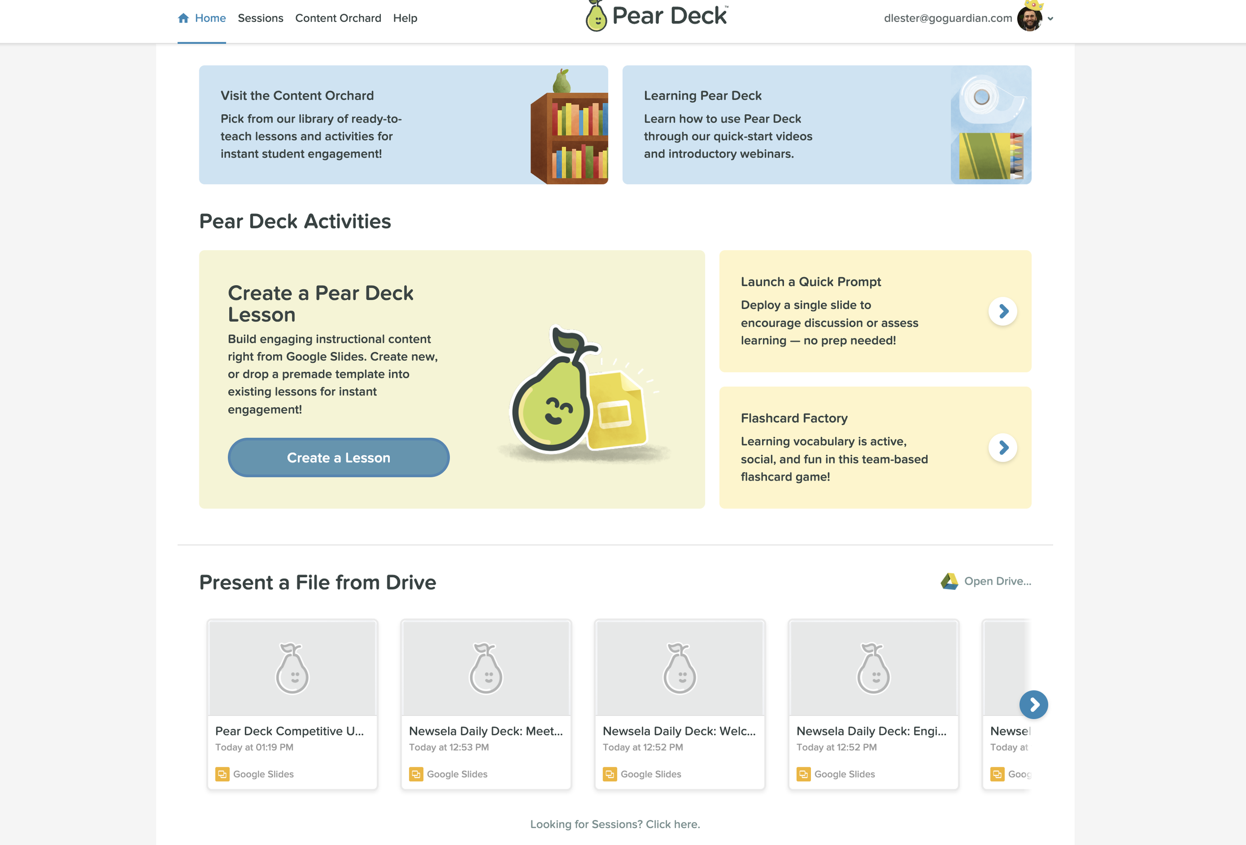
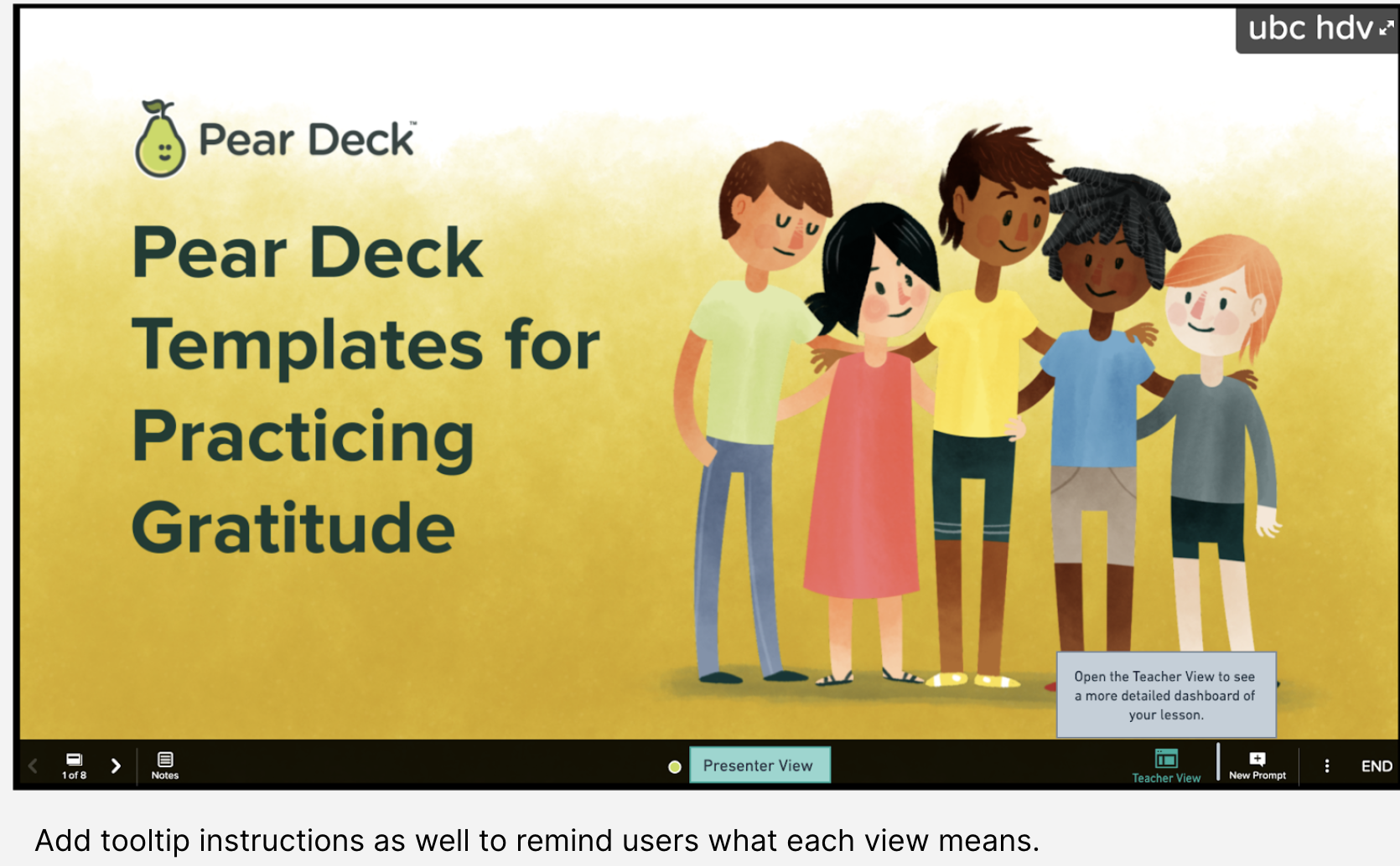
From “Teacher Dashboard” to “Teacher View”
By changing a single term, everything becomes more clear. Plus, we made it clear which view teachers were currently in.
Further Home page updates
By separating Pear Decks from Google Slide decks, users are able to distinguish one from the other
By giving them options to present a file or open an existing one, this choice becomes clearer